Wellington Region Population Forecasts
In 2021 I worked with Sense Partners who develop population forecasts for the Greater Wellington Regional Council.
I built the website to visualise their forecasts for interested public, community groups, senior council officers and councillors - to access, understand and use key forecast outputs and data.
The visualisations were primarily built using ChartJS, Mapbox, D3 and Bootstrap Tables.
Examples of the charts and maps:
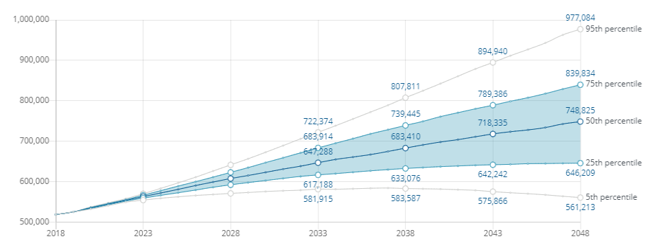
Line chart showing the population forecasts for the whole region from 2018 to 2048
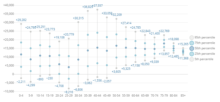
Dot plot showing the forecasted change in population by age band from 2018 to 2048
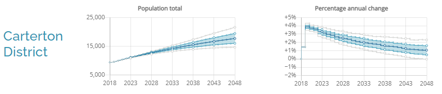
Line charts showing the population forecasts for the Carterton District
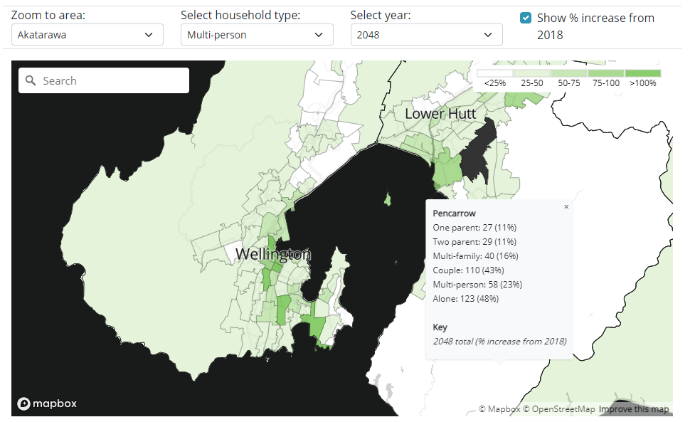
Choropleth map to explore the forecasts by suburb or SA2 areas, across different measures
This project was undertaken while I was employed at Redvepsa Consultants Ltd.
